There’s a practical reason for that. Football clubs are unusual brands because so much of their identity is effectively sacred. You can’t casually redesign a 100-year-old badge, change the colour of the home kit or throw away the symbols supporters have grown up with. Or rather, you can, but history tells us that supporters are very willing to tell you when you’ve got it wrong.
Typography gives clubs another way to evolve. It offers the potential to create something recognisably new without rejecting what already exists. A club can change the way it speaks, behaves and presents itself while leaving those most emotive assets untouched. Done well, a typeface becomes a bridge between heritage and whatever the club wants to become next.

The shift isn’t that typography has suddenly arrived in football. It’s that its role has expanded. Shirt lettering remains hugely important — although leagues, cups and other rights holders now play a greater role in creating unified type systems across competitions — while clubs are increasingly developing their own typographic languages elsewhere.
Bespoke families are now being built to work across stadiums, social content, retail, fashion, campaigns, hospitality and communications. That means typography is increasingly responsible for carrying a club’s personality into all the places where the badge either can’t or shouldn’t do all the work.
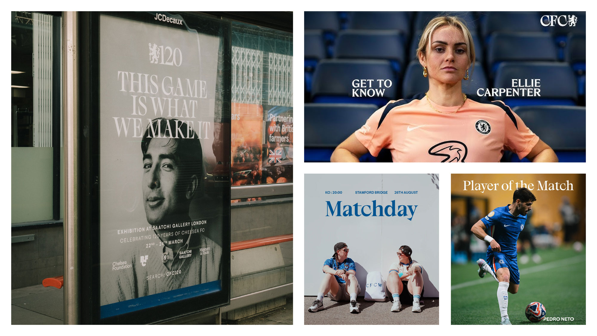
Chelsea is a good example. F37’s recent custom type system for the club contains four distinct styles, developed from visual characteristics within Chelsea’s lion crest. The foundry describes the brief as deliberately moving away from football’s traditionally “shouty” sans-serif language, creating something more stylish and culturally expressive while still deriving its features from something unmistakably Chelsea.

There’s also a nice bit of continuity here for us at LoveGunn. The identity has evolved from Chelsea Basis, the club’s existing typographic foundation, from which we previously created a bespoke font and identity for Junior Blues, Chelsea’s platform for younger supporters. It’s a small example of how a strong typographic idea can stretch across different audiences and experiences without having to reinvent the club each time.
That last point is important. The interesting thing isn’t simply that Chelsea uses a serif. It’s that the type has a reason to be Chelsea’s.
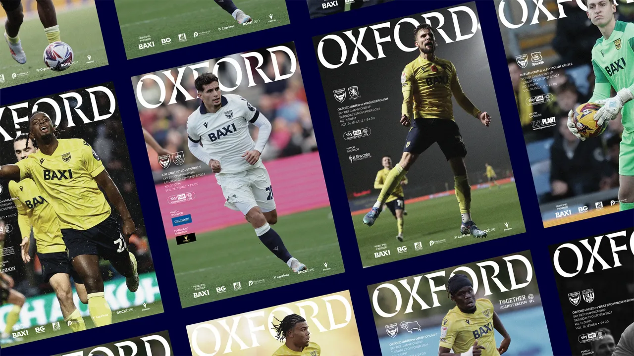
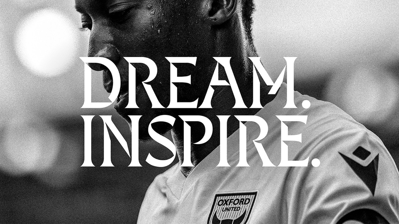
It was something we thought about extensively when developing the identity for Oxford United. Our work began with research into the club, its supporters and the city around it, and the eventual visual system drew from Oxford’s architecture, educational heritage and skyline. The aim wasn’t to make Oxford United look fashionable. It was to create an identity that felt as though it could only have come from Oxford.
.jpg)
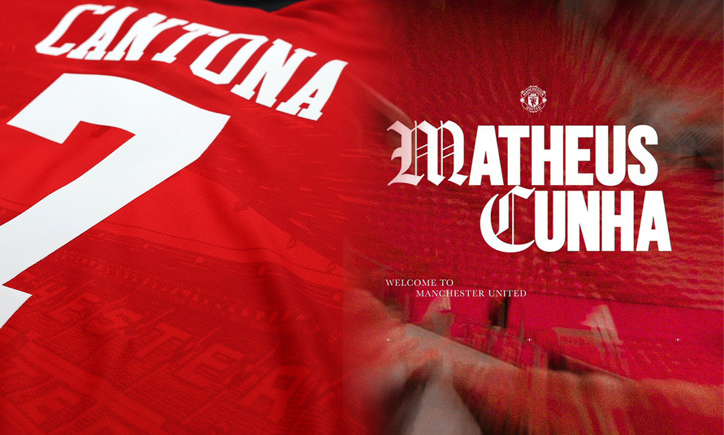
I also like the way Manchester United has explored typographic details connected to its devil and trident. Again, the principle is more interesting to me than simply whether a particular serif or sans-serif looks good. When an element of type can trace its origin back to something supporters already recognise as theirs, typography stops being decoration and starts becoming another piece of the club’s visual language.
For a long time, football had a fairly recognisable typographic code. Condensed, extended, bold, black sans serifs did much of the heavy lifting. They looked strong, fast and sporting. They were legible on screens and stadium graphics. They did the job.
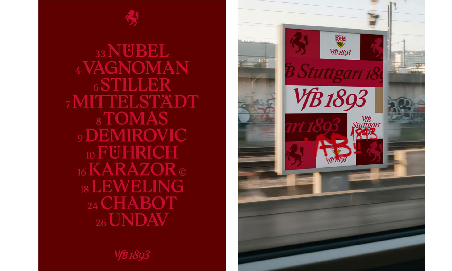
Now we appear to be moving in another direction. Serif typefaces, higher-contrast letterforms and more editorial compositions are appearing more regularly across the game. In many cases, they are borrowing visual cues we would traditionally associate with fashion, magazines, hospitality and luxury.
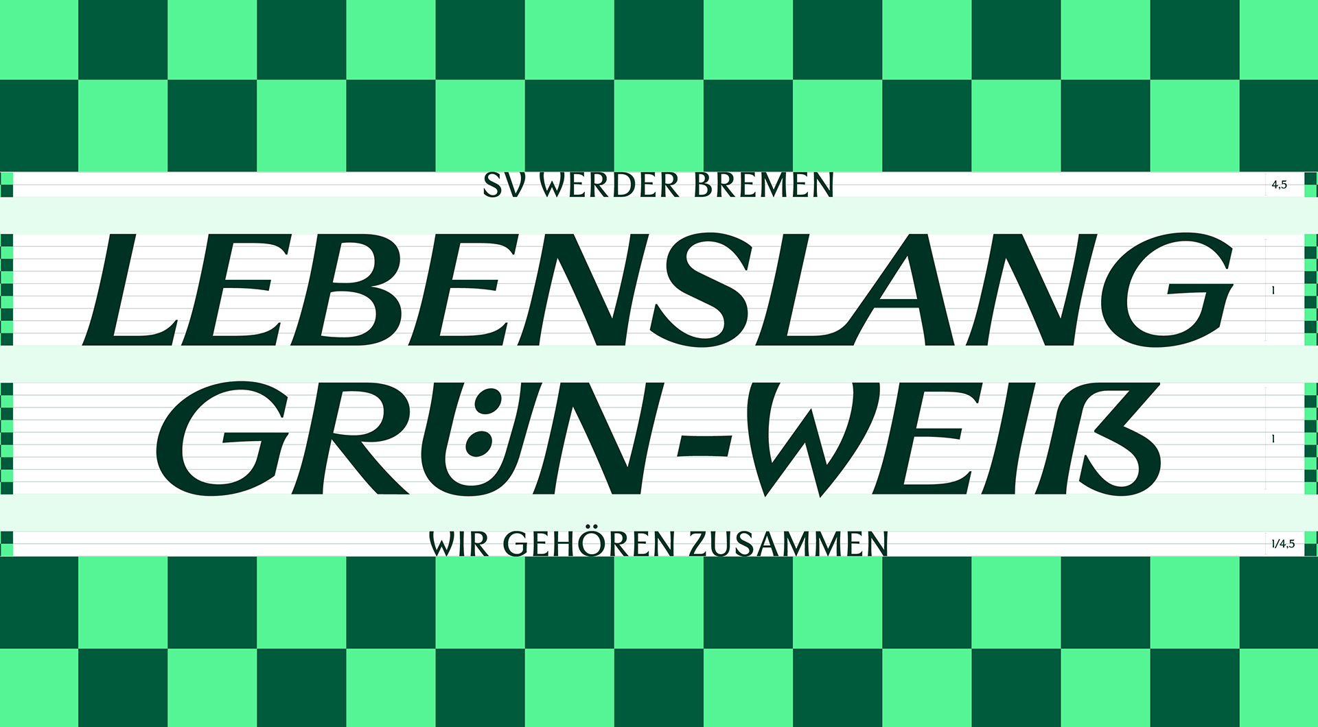
I don’t think that is a coincidence. Football is increasingly interested in everything that happens beyond the 90 minutes on the pitch. Clubs want to be fashion brands, entertainment brands, community organisations, content publishers and cultural institutions. At the same time, fashion has moved closer and closer to football. Shirts have become streetwear, players are fashion personalities and clubs are collaborating with designers, musicians and lifestyle brands.
Typography inevitably follows that movement. If a club wants to occupy more cultural territory, it makes sense that its identity begins to borrow some of the visual codes of those worlds.
The problem comes when a useful creative device becomes a shortcut.
For years, sans serif said “sport”. There is a danger that serif now simply says “culture”.
If every ambitious club decides it needs to look premium, editorial and fashion-led, we haven’t solved football’s sameness problem. We’ve just replaced one version of it with another.
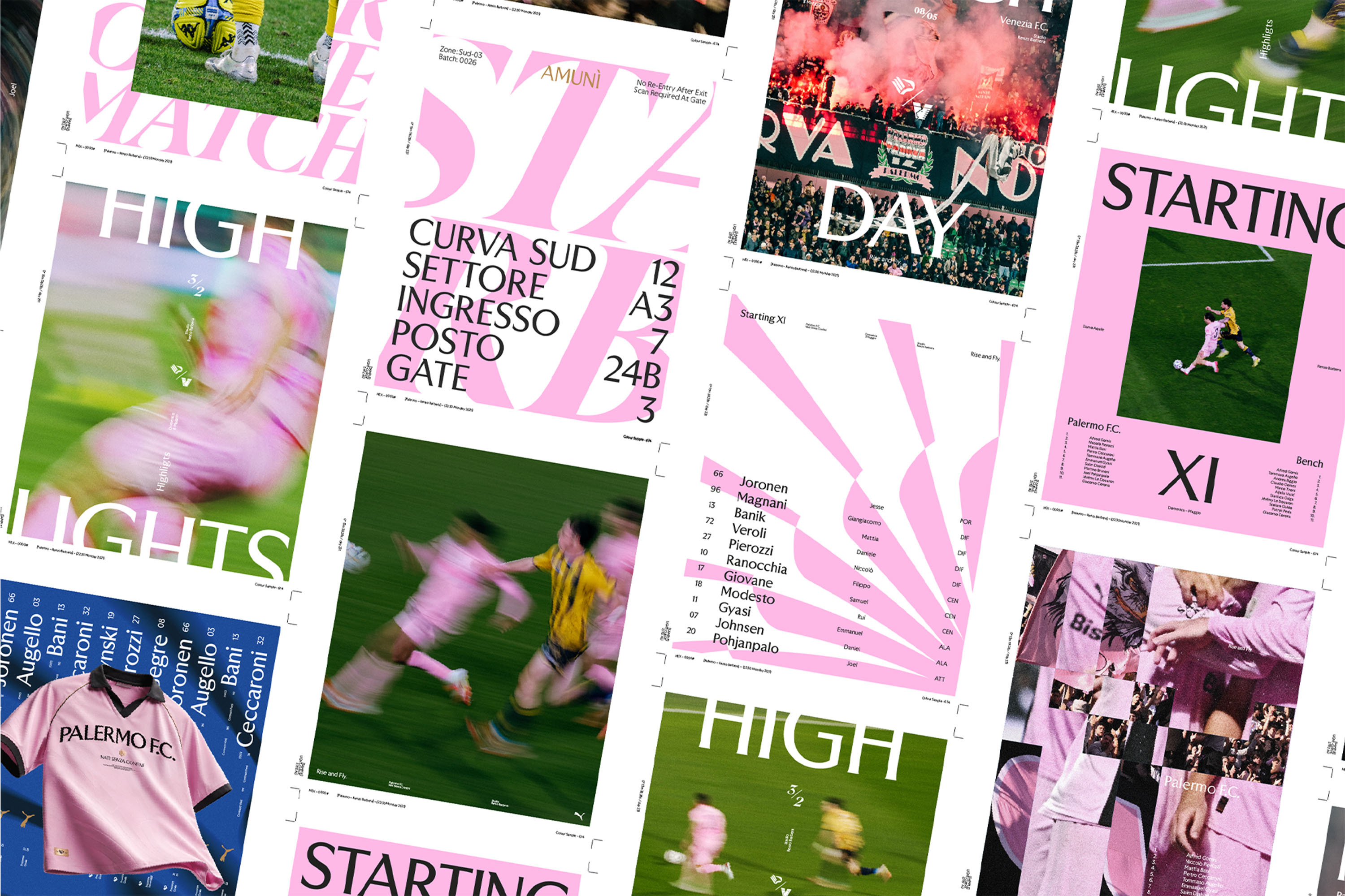
This was the thought that came to me when I saw Palermo FC’s new visual identity.
There is plenty to like about it. Palermo has extraordinary raw material as a brand: the pink and black, the city, Sicily, the architecture, the history and a fanbase with a strong sense of identity. The new system looks sophisticated and the typography has character.
There is also considerably more thinking behind the project than a casual glance might suggest. Palermo says the identity was developed over more than a year with input from fans, staff, players and former players. The system includes three bespoke type families intended to work together as a “mosaic”, reflecting the different cultural influences on the city, including its Arab-Norman roots and Mediterranean heritage. The project was developed by Palermo and City Football Group’s marketing teams with Alkemy.
So this isn’t a case of there being no story.
My question is whether enough of that story has made it into the typography itself.
For me, it hits the post rather than ending up somewhere in row Z. It’s good. It retains charm and personality. But strip away the pink, the photography and the surrounding visual system and ask yourself a much harder question: would you immediately recognise the typography as Palermo?
I’m not sure I would.
That’s a subjective judgement, obviously, and others will look at the same work and disagree. But I think it points towards the bigger challenge facing clubs as typography becomes a more prominent part of football branding. If you are going to make type one of your defining assets, “does it look good?” isn’t a high enough bar. The more valuable question is whether it feels unequivocally yours.
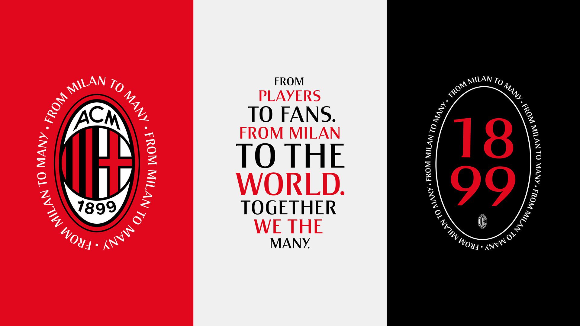
None of this means clubs should avoid serifs, editorial design or anything else simply because it happens to be fashionable. Design has always responded to culture. Trends can move industries forward, break conventions and give designers permission to try something that would previously have been rejected.
The problem is when trend becomes strategy.
A serif isn’t inherently more cultural than a sans serif. A fashion-influenced art direction doesn’t automatically make a football club fashionable. And making something feel premium isn’t necessarily the right ambition for every club in the first place.
Whose culture are you actually borrowing from? Why does it belong to you? Does it sound like the club when the supporters speak? Does it reflect the city around it? Does it help express the future the club is trying to build?
Not every club can, or should, feel “premium”, “cultured” or “fashion-led”. Football is interesting precisely because its clubs are so different. Some are polished and cosmopolitan. Some are abrasive. Some are eccentric. Some are working-class, provincial, rebellious, traditional, chaotic or proudly unfashionable. Flattening all of that into the same contemporary cultural aesthetic would be a huge missed opportunity
A lot of work goes into rebranding a football club, a rights holder or a competition. We’ve done it, and one thing I’m certain of is that our next football brief won’t begin by looking at what typefaces are currently fashionable.
The work has to start much further upstream.
You interrogate the heritage. You speak to supporters. You understand the community and geography. You look at the competitive context, the commercial ambition and the kind of future the organisation wants to project. You work out what needs protecting, what can evolve and what the brand needs to become capable of doing that it cannot do today.
Only then do you start making decisions about typography.
That doesn’t guarantee that the result won’t happen to align with a wider trend. It might. A serif may be exactly the right answer. So might a grotesque sans, a handwritten face, a highly decorative display typeface or something nobody else in football would currently dream of using.
The important thing is that you arrive there from the inside out.
Because trends will move. The current fashion for serif-led football identities will eventually give way to something else, just as the condensed sporting sans serif did before it. But if your typography is rooted in the club’s history, place, personality and ambition, it has a chance of outlasting the aesthetic moment that surrounded its creation.
And perhaps that is the test football clubs should be applying when they create these identities. Not simply, “Does this make us look current?” but, “Could this type belong to anyone else?”
If the answer is yes, you probably haven’t pushed it far enough.
There’s a practical reason for that. Football clubs are unusual brands because so much of their identity is effectively sacred. You can’t casually redesign a 100-year-old badge, change the colour of the home kit or throw away the symbols supporters have grown up with. Or rather, you can, but history tells us that supporters are very willing to tell you when you’ve got it wrong.
Typography gives clubs another way to evolve. It offers the potential to create something recognisably new without rejecting what already exists. A club can change the way it speaks, behaves and presents itself while leaving those most emotive assets untouched. Done well, a typeface becomes a bridge between heritage and whatever the club wants to become next.
The shift isn’t that typography has suddenly arrived in football. It’s that its role has expanded. Shirt lettering remains hugely important — although leagues, cups and other rights holders now play a greater role in creating unified type systems across competitions — while clubs are increasingly developing their own typographic languages elsewhere.
Bespoke families are now being built to work across stadiums, social content, retail, fashion, campaigns, hospitality and communications. That means typography is increasingly responsible for carrying a club’s personality into all the places where the badge either can’t or shouldn’t do all the work.
Chelsea is a good example. F37’s recent custom type system for the club contains four distinct styles, developed from visual characteristics within Chelsea’s lion crest. The foundry describes the brief as deliberately moving away from football’s traditionally “shouty” sans-serif language, creating something more stylish and culturally expressive while still deriving its features from something unmistakably Chelsea.
There’s also a nice bit of continuity here for us at LoveGunn. The identity has evolved from Chelsea Basis, the club’s existing typographic foundation, from which we previously created a bespoke font and identity for Junior Blues, Chelsea’s platform for younger supporters. It’s a small example of how a strong typographic idea can stretch across different audiences and experiences without having to reinvent the club each time.
That last point is important. The interesting thing isn’t simply that Chelsea uses a serif. It’s that the type has a reason to be Chelsea’s.
It was something we thought about extensively when developing the identity for Oxford United. Our work began with research into the club, its supporters and the city around it, and the eventual visual system drew from Oxford’s architecture, educational heritage and skyline. The aim wasn’t to make Oxford United look fashionable. It was to create an identity that felt as though it could only have come from Oxford.
I also like the way Manchester United has explored typographic details connected to its devil and trident. Again, the principle is more interesting to me than simply whether a particular serif or sans-serif looks good. When an element of type can trace its origin back to something supporters already recognise as theirs, typography stops being decoration and starts becoming another piece of the club’s visual language.
For a long time, football had a fairly recognisable typographic code. Condensed, extended, bold, black sans serifs did much of the heavy lifting. They looked strong, fast and sporting. They were legible on screens and stadium graphics. They did the job.
Now we appear to be moving in another direction. Serif typefaces, higher-contrast letterforms and more editorial compositions are appearing more regularly across the game. In many cases, they are borrowing visual cues we would traditionally associate with fashion, magazines, hospitality and luxury.
I don’t think that is a coincidence. Football is increasingly interested in everything that happens beyond the 90 minutes on the pitch. Clubs want to be fashion brands, entertainment brands, community organisations, content publishers and cultural institutions. At the same time, fashion has moved closer and closer to football. Shirts have become streetwear, players are fashion personalities and clubs are collaborating with designers, musicians and lifestyle brands.
Typography inevitably follows that movement. If a club wants to occupy more cultural territory, it makes sense that its identity begins to borrow some of the visual codes of those worlds.
The problem comes when a useful creative device becomes a shortcut.
For years, sans serif said “sport”. There is a danger that serif now simply says “culture”.
If every ambitious club decides it needs to look premium, editorial and fashion-led, we haven’t solved football’s sameness problem. We’ve just replaced one version of it with another.
This was the thought that came to me when I saw Palermo FC’s new visual identity.
There is plenty to like about it. Palermo has extraordinary raw material as a brand: the pink and black, the city, Sicily, the architecture, the history and a fanbase with a strong sense of identity. The new system looks sophisticated and the typography has character.
There is also considerably more thinking behind the project than a casual glance might suggest. Palermo says the identity was developed over more than a year with input from fans, staff, players and former players. The system includes three bespoke type families intended to work together as a “mosaic”, reflecting the different cultural influences on the city, including its Arab-Norman roots and Mediterranean heritage. The project was developed by Palermo and City Football Group’s marketing teams with Alkemy.
So this isn’t a case of there being no story.
My question is whether enough of that story has made it into the typography itself.
For me, it hits the post rather than ending up somewhere in row Z. It’s good. It retains charm and personality. But strip away the pink, the photography and the surrounding visual system and ask yourself a much harder question: would you immediately recognise the typography as Palermo?
I’m not sure I would.
That’s a subjective judgement, obviously, and others will look at the same work and disagree. But I think it points towards the bigger challenge facing clubs as typography becomes a more prominent part of football branding. If you are going to make type one of your defining assets, “does it look good?” isn’t a high enough bar. The more valuable question is whether it feels unequivocally yours.
None of this means clubs should avoid serifs, editorial design or anything else simply because it happens to be fashionable. Design has always responded to culture. Trends can move industries forward, break conventions and give designers permission to try something that would previously have been rejected.
The problem is when trend becomes strategy.
A serif isn’t inherently more cultural than a sans serif. A fashion-influenced art direction doesn’t automatically make a football club fashionable. And making something feel premium isn’t necessarily the right ambition for every club in the first place.
Whose culture are you actually borrowing from? Why does it belong to you? Does it sound like the club when the supporters speak? Does it reflect the city around it? Does it help express the future the club is trying to build?
Not every club can, or should, feel “premium”, “cultured” or “fashion-led”. Football is interesting precisely because its clubs are so different. Some are polished and cosmopolitan. Some are abrasive. Some are eccentric. Some are working-class, provincial, rebellious, traditional, chaotic or proudly unfashionable. Flattening all of that into the same contemporary cultural aesthetic would be a huge missed opportunity
A lot of work goes into rebranding a football club, a rights holder or a competition. We’ve done it, and one thing I’m certain of is that our next football brief won’t begin by looking at what typefaces are currently fashionable.
The work has to start much further upstream.
You interrogate the heritage. You speak to supporters. You understand the community and geography. You look at the competitive context, the commercial ambition and the kind of future the organisation wants to project. You work out what needs protecting, what can evolve and what the brand needs to become capable of doing that it cannot do today.
Only then do you start making decisions about typography.
That doesn’t guarantee that the result won’t happen to align with a wider trend. It might. A serif may be exactly the right answer. So might a grotesque sans, a handwritten face, a highly decorative display typeface or something nobody else in football would currently dream of using.
The important thing is that you arrive there from the inside out.
Because trends will move. The current fashion for serif-led football identities will eventually give way to something else, just as the condensed sporting sans serif did before it. But if your typography is rooted in the club’s history, place, personality and ambition, it has a chance of outlasting the aesthetic moment that surrounded its creation.
And perhaps that is the test football clubs should be applying when they create these identities. Not simply, “Does this make us look current?” but, “Could this type belong to anyone else?”
If the answer is yes, you probably haven’t pushed it far enough.


